Showing posts with label Photoshop. Show all posts

Thursday, February 24, 2011

Using Color Print Filters for Digital Editing

In my years of shooting film, I’ve stumbled across some great gadgets built for film photography that can be used in digital photography.  My color correction filter pack is one of them.

IMG_6630IMG_6632

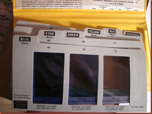
They come in a whole pack with both CMY and RGB filters, each with their own gradient.  The purpose of these was originally to help with color correction in a darkroom (color darkroom printing post coming soon, so you’ll see what I mean).

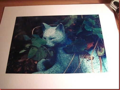
Example, here’s a color print I hand processed in my color darkroom.  I love it, and if you follow my color film photography you know I often add a color cast to photos.  In this case, I added a hint of blue.

IMG_6631

These are simple enough to use.  Pick the color that is opposite to the color you think you’ve made a mistake with (so for blue cast, I’d grab yellow).  Look through the various viewing windows until the colors look right to you, then read the box below to see how to correct this in a darkroom enlarger.

IMG_6633

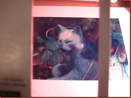
Here’s when we view the photo through a yellow filter.  The blue cast is corrected.

IMG_6634

Here’s when we look through a magenta filter.  It’s pretty easy to tell that we don’t need any additional magenta in this photo. 

IMG_6635

So, that’s pretty much it for film.  Just keep looking through squares until it looks right, make the suggested adjustments and run your next print through. 

Now, how can we apply this to digital?  Here’s a SOOC shot I took at a wedding.  It has a cyan/blue cast that I don’t like.  Let’s use the filters and see what could work better.

IMG_8663 (1)

I held the yellow filter card up to the screen and we can see that the middle filter is the closest to correcting the color.  The left is too yellow, and the right is too blue.

IMG_6638

So, how is this more useful that just using Photoshop tools?  Sometimes it’s not.  The white balance auto-correct in camera raw works well a lot of the time, and you can eye your colors using a lot of the color correction tools built in.  Why this is handy is because camera raw doesn’t always get a perfect white balance.  Also, this gives you a starting guide with color correction without having to wait for actions to process or having to use the history button.

The only drawback I’ve found is that color correction units (which the cards use) don’t currently translate to Photoshop CS4.  While doing a quick Google search, I found there are plug-ins you can get which will translate color correction units to Photoshop.  In the meantime, I think this at least provides us with a shortcut and an idea of where we’re going.

Happy editing!

Kelly

Friday, January 7, 2011

Free Action Set–Part 1

I am still working on actions, but instead of waiting until I had some huge set put together, I decided I’ll be uploading them in small chunks. 

This first set, which I call Glamazon, has 4 editing actions for retouching portraits and enhancing your photo’s subjects.

231 composite

To use this set, you’ll be using layer masks.  On each action, the layers describe that feature they will enhance, simply unmask that feature using the white brush on your layer mask.  The “Soft Light” action is an overall enhancer and has no layer mask.

Finally, I set some opacity levels that make a good starting point, but be sure to tweak them so they work best for your photo.  This is especially true of “Sharp Eyes” which should be turned down for darker eyes.

Enjoy and please leave feedback about the set.  I’m new at this, and I know there will be room for improvement.  I will post updates as I stumble across them.

You can download the set from Deviant Art at http://klsphotography.deviantart.com/#/d36mi9u

Thursday, December 30, 2010

Irony and Photoshop Actions

I love photoshop actions.  They make life easy sometimes, and they also open you to a world of downloadable artistry.  I’ve made a few of my own actions, and I like to create more every day.  However, I know when I’m naming them, they don’t always make sense to me.  I have an action named “Roman” after Roman Loranc, whose moody black and white shot with red filter make me love cloudy days and intense skies.

I also find that while the actions usually in some way describe what the finished photo will look like, some of the combinations make me laugh.

Here’s my example of irony.  I edited this shot of my niece using Pioneer Woman’s Lovely and Ethereal.

IMG_6589_1 lovely

Not sure if I would describe this photo with those words…. but I did get a nice laugh out of it.

Shasta Betty

PS – I hope to be uploading my own action set soon, as a FREE download.  Keep an eye out.

Friday, November 19, 2010

Photoshop Action Sets

One thing I’ve really loved lately has been finding and playing with Photoshop action sets that others have created.  It inspired me to create a few of my own, automating things I use fairly frequently.

Here’s a sneak peak at a couple of the actions I’ve finished so far, which I’ve put to use on my work.  I’m also looking for a few Beta testers who will get the actions for free.  Email me at klsphoto@hotmail.com for more details.

Onto the actions:

Action Set 1 – Glamourize
This is a nice set with actions to optimize skin, teeth, eyes and overall photo look.  It gives everything a little “bling.”

Before (this particular photo was shot by Melanie, the woman in the photo.  She just gave me permission to play with it.)

231

After

edit

This set smoothes the skin, brightens teeth and eyes and boosts eye color as well as overall color of the image.

Another one, before

 IMG_0180

After

edit2

I actually love the eye action so so so much, I don’t think I’ll edit another portrait without using it again.  It’s magical.

Action Number 2, I call Try-Ex and it replicates the look of one of my favorite films.

Before

 IMG_0214

After

edit3

This is one of my favorite films because it really sucks up imperfections and gives everything a vintage look.

Another Before

IMG_7215

After

edit4

Action 3 – Great for sky and cloud landscapes.  I call it Roman

Before

IMG_4821

After

Before

IMG_4850

After

Action 4 - Finally, a nice vintage action.

Before.  I also used some of the glamourize actions on this before using the Vintage action.

IMG_8776

After

edit7

Before

IMG_7182 - Copy

After

edit8

So, that’s what I’ve been working on over the past week or so.  I’ll post more actions as I come up with them.  In the meantime, if you’d like to test these nice actions out for free as a beta tester, get in touch.  Thanks!

SB

Thursday, November 11, 2010

Photoshop, a before and after

I’m getting more and more into using Photoshop actions, as well as adding textures.  Layer masks and I have become good, good friends…  Here’s a couple quick before and afters of things I’ve been playing with.

Before

IMG_1378

After playing with levels and adding a couple textures.  Very important: using layer masks or the healing tool with textures.  Not all textures look good on skin.

IMG_1378 texture

Before… flat.

IMG_2161

I rendered spotlight to brighten the center of this photo and then amped up the saturation of the reds.

IMG_2161 edit

Most of my work is still straight out of the camera, but I’m starting to like Photoshop more and more.  I’ve also been working on creating some of my own actions (In part because I can’t afford to buy some of the great sets out there, but also because I can achieve the effect on my own, but it’s nice to automate it).

Looking ahead:  I got a film scanner for my birthday, so I’ll be working on digitizing my film work.  :)  

Tuesday, July 13, 2010

Post process - Vignetting

IMG_9620 I like vignetting in my photography.  Vignetting is where the edges of your photos are darker than the center.  It’s something I’ve been especially drawn to after viewing Nick Brandt’s work.

In the darkroom, vignetting is creating by burning down corners before developing or using a circle to dodge the center.

However, far easier and more accessible, is vignetting in digital photography.  If you have a pretty good grasp on Photoshop, you can create this effect with just a couple layer adjustments. 

Most people create this effect by burning in the corners, but I learned a technique from photographer John Rickard that I love and I think most will prefer after trying it.

Original photo, no post processing:

Vignetting using the “burn” feature in Photoshop:

This photo illustrates the 3 reasons I don’t like to vignette with the burn feature.

The vignette isn’t circular.  It’s possible to get a perfect circle this way, but much harder.

The darker areas are gray as opposed to dark (you’ll see more clearly in further examples) unless you take the time to burn highlights, midtones and shadows.

The edges aren’t well blended.

Now, vignetting using layers, levels and eraser:

Much better.  The darkness in the top corners is much more progressive and the effect is less obvious.  Although, if obvious is what you’re going for, it can also be done as seen in the first photo of this post with a little tweaking, though still keeping a natural looking fade.

I also like that the vignetting is circular.  Plus, this method is faster than burning.


One more in black and white with some other editing.  I think vignetting is always more intense in grayscale.

How to (click any image to see it larger):

duplicate layer In Photoshop, open your layers tab and duplicate the background layer. 

If you’ve created other adjustments, pay attention to the order of your layers or flatten the image. 

curves layer In the duplicate layer, create a levels adjustment layer then clip it to the duplicate layer.  Adjust the photo so that it’s dark.  Right now the whole photo will be dark, but just pay attention to the clipping maskedges and see if they’re where you want them.

This is where you can decide how strong the effect will be.  The shape of the vignette will depend on erasing in the next step.

Finally, take your eraser tool and adjust it to a HUGE circle almost the size of your photo. 

eraser Select your duplicate layer and erase the middle until it looks right.  It’s quick, so be gentle.

For more obvious edges use a smaller radius on the eraser and loop it around the area you want brighter.  You can also dial up the hardness of the eraser tool. 

Final Product:

IMG_9845 fix 

And one last example (and the image I learned this technique with after showing), in case you’re not convinced:

Burning                             vs                     Layer/Eraser Method

IMG_1988 IMG_1988

The first example shows the grayness of burning and how it’s less than ideal in some photos.

Sorry if that was long, but it’s worth learning.  There’s a lot of advantages to having different ways to create effects in post processing. Another hint for vignetting using a 3rd technique, look into selections and refine selection.  You can soften the edges of your selection in this menu.  I might show some examples next post…

Happy editing!

Monday, March 15, 2010

High Dynamic Range

So, this is a little different than the normal stuff I write about, but I still consider it part of alternative photographic processes, even though it’s something you do in post-processing.  High Dynamic Range, or HDR, describes merging photos using Photoshop or a similar program to achieve photos with a higher range of luminance.

In standard photos, you can usually expose to highlights or shadows or midtones, but our eyes have the ability to see all those ranges is a more dynamic way than our camera can capture.

This is a really great thing to do for all those pictures of white Mt. Shasta and it’s dark tree line.  If you want to give it a try, the first thing is to look into your camera’s settings and figure out how to take multiple exposures (2 or 3) at different exposures using the same aperture.  For my Canon 50D, I set the mode to Aperture priority and go into the exposure settings in the menu and tell it to bracket to 1 stop above and below, so the camera will take a series of 3 photos.

Example of photos:

Standard exposure – this is a decent photo of the mountain and fairly typical for what is seen, but the mountain is actually blown out a little because of the difference in tones.

IMG_0399

Over exposed by 1 stop

IMG_0401 

Under exposed 1 stop

IMG_0400

Then, these are merged using different programs.  In Photoshop, you use the File>Animate>Merge to HDR function (Google for more comprehensive tutorials).

The result:

HDR2

You can see how the trees are properly exposed and the mountain is a rich white with dynamic shadows and dark ridges.

Anyway, sometime to play with if you feel like it.  In the meantime, I’m working on a couple different film processes and use of different cameras, but film takes time to process and the COS darkroom is closed this week, so I promise an update soon-ish…