Sunday, March 27, 2011

Cross Processing

Everyone with an iphone or a Droid with a funky camera phone app has probably heard of Cross Processing (aka X-Pro) and knows the photos come out greenish/yellowish/bluish depending on the app.  But did you know there is a whole film developing process behind cross processing that created the inspiration behind the apps?

Cross Processing is when you take color slide film (usually a positive film that is developed in E6 chemicals) and develop it in color negative developers (your normal negative film is developed in C41 chemicals) or visa versa.  I recently bought slide film with this specific intention.

First, I want to point out that whatever chemicals you use to develop will dictate whether the film comes back as negatives or positives.

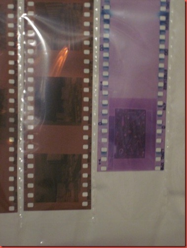
Second, the X-pro slide film comes back a weird color.  I knew even before I got this in the darkroom that things were going to be interesting…  Left, normal negative.  Right, X-pro slide film.

IMG_6727 

I processed these by adding a lot of yellow to the color filter pack (which removes yellow from the print), but you can see how green these are.

Just for comparison, I took a “cross processed” photo with the Vignette app on my phone.

1300827836161

Hmmm… well, that’s neat.  It’s missing the grain and texture of the film.  But I still don’t think digital is anywhere close to being on the same level as film as far as printing and effects.  I love the cell phone apps, and they’re plenty cute, but if you like the look I highly suggest shooting a roll of film and having it cross processed at your local photo lab.  There is nothing like it.

Kelly

Wednesday, March 16, 2011

Something to play with

So, this is entirely random and experimental, but I think there is somewhere interesting to go with this.  I like to play with slow sync flash, it has interesting results - especially with motion or crazy background lights.  I’m still planning on writing a whole tutorial about this, first curtain, second curtain, etc.  For now, here’s an odd result I found and wasn’t expecting from slow sync flash…

I really want to write about exactly why I think this happened, but this isn’t that kind of post.  This is about asking YOU to help me figure out the effect and use some of the theories to play with this effect.  I think what makes an effect efficient is when you can replicate it, so it’s time to figure out the mechanism behind this happy accident!

Note:  All of these are SOOC, straight out of camera, no editing, nothing.

Okay, manual settings… all of these shots are f14, 1/2, ISO 800, on camera flash, tungsten lighting, auto WB (which I’m now wishing I had been specific about).

Shot 1.  I held really still.  This is a fairly typical slow sync flash shot.  Just putting it up for comparison.

IMG_9157

Shot 2 and 3, after the flash fired, I violently shook and swirled the camera all over the place for the remainder of the exposure.  The backdrops for both shots were mostly blank walls, minimal tungsten lighting from behind me.

IMG_9155IMG_9161

So, everything came out a little vintage looking.  Faded colors, yellowish tone.

Theories:

- The faded colors are because of the transparency of having the extra exposure.
- The clearness of the effect was because the background was fairly blank (white walls).
- The yellow tone is because of the blending light temperatures in the Auto WB (it could have been reading for only the flash)
- The short exposure only allowed in a small amount of weirdness…
- My camera was jealous of my using the Retro Camera app for most of my 365 project lately and decided it could be vintage too.

Well, maybe not that last one.

Alright, photography community, please weigh in with your thoughts or expertise!  I plan on playing with this in more scenarios and with different subjects to see how it plays out.  Happy shooting!

Kelly

Wednesday, March 9, 2011

Side lighting

I wrote a post about this about a year ago, but I decided to take down the original post so I could go back and tackle this subject again.

I really love side lighting.  It’s really wonderful for shooting indoors in black and white and creating a wonderful, moody photo.

So much of how your photo’s mood is seen has to do with lighting.  I think side lighting can be somber, pensive, quiet and deeply emotional.

This shot takes an interesting turn on child portraiture.  She’s cute as a doll, but it’s a sweet, quiet, pensive shot - which I feel comes from the shadows and contrast.

IMG_2237

Same idea, different day.  I shot with the light of a glass door between her and I, then bumped the contrast even more in post processing.

The moodiness the light lends puts her deep in thought.

IMG_9347

This also reads as a somber mood to me, even though the light is more behind him than to the side.

IMG_2341

So, what do we take out of all this?  First, use natural light.  Second, break all the rules for using light!  Put the light behind your subject, next to it.  Experiment.  Photography isn’t a science, it’s an art and you will need to break rules and experiment to find your personal style.

Kelly

Thursday, March 3, 2011

A quick color printing guide

James Gilmore sometimes calls me the Queen of the Color Darkroom.  It’s a smelly, bleachy kingdom, but I’m happy to rule over it because I LOVE color photo printing.  There are plenty of photographers out there with black and white darkrooms, but for not a lot more effort, you could be creating color prints.  Think about what you could do with a Holga and a little cross processing or expired film! 

First, make your life easy and have your color film developed by someone else.  This is a hard one for me since I sit in the pitch black reeling film and stand at a sink agitating tanks for days on end with my black and white.  I know to push Tri-X and to pre-wet my film.  So if I can let go and drop my film off at a lab, so can you. 

Recommended:

-Crown Camera in Redding for 120 if you’re local.  Ask for process only and make sure they do it in house and you can get it back in a day or two.

-Any Rite Aid or 1 hour photo for 35mm.  It’s fast, it’s cheap.  Process only!

-Mail your film to Photoworks in SF.  If you call, they’ll even send you the padded mailing envelopes to send it in, prepaid postage and all.  http://www.photoworkssf.com/services-and-rates/mail-us-your-film

Now, let’s head to a color darkroom!

You really only need a couple things in addition to your black and white darkroom setup.

-A color enlarger (if you’re clever, you can turn off the filter packs on these and print black and white with it as well, great multi-use piece of equipment).
-A color print processor (this can be tricky, but some hobby processors sell for relatively cheap and they keep the chemicals at the right temperature – which is what makes color about 20% more difficult that black and white as far as darkroom setup)
-Color print safelights.  I’d like to point out that these don’t actually provide a lot of light, so also grab some glow in the dark tape to keep yourself from running into stuff.

Don’t want to hassle all that?  Take Art 11b from James Gilmore at College of the Siskiyous, it’s all set up for you.

Here we go… put your negative into an enlarger.  Fun fact: I have a similar Omega color enlarger at my house.  It’s in the garage until summer when it’s warm enough to put a darkroom in our work shed.

IMAG0022

Set up an easel.  Turn off the lights and focus your print and all that fancy stuff.  I’m printing something square here, thus the square setup on the easel.

IMAG0023

Now we need to set our exposure time and color filter packs.  You’ll be adjusting your dye packs to achieve color balance while also adjusting exposure.  It’s super fun.

IMAG0024

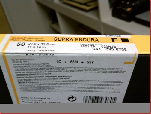
If you have a nice printing paper, like Kodak Supra Endura, they list some starting points for color balance – as each type of paper is slightly different.
IMAG0025

Okay, now run a test print and put it in the processor.  Isn’t that the cutest little processor?  Don’t bump it though!!!

IMAG0026

Here’s a print.  Wait til it’s dry.  Using the color correction filters from the last post, see what color adjustments you need to make.  This print is too yellow, so I’m going to ADD 10 yellow to my color filter pack.  It’s backwards, but that’s how it works.

IMAG0027

Finally, you have a print.  This is one of my Diana with gel flash and expired film weird prints.  I love ‘em.  I’m going to run off about 10 more and sell them at the Dunsmuir Co-Op Gallery opening March 26th!

IMG_6653

Here are 2 more that I’m in love with – but they got thrown in a display case at the COS art department before I could photograph them.

1299106433775

And that’s all there is to it.  It’s pretty easy, give it a try.  If you’re at COS, I’ll even come help you – since I’m the queen and all. *winks*

Kelly