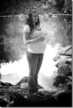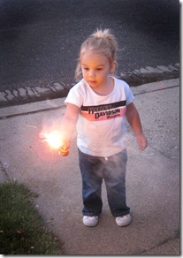
In the darkroom, vignetting is creating by burning down corners before developing or using a circle to dodge the center.
However, far easier and more accessible, is vignetting in digital photography. If you have a pretty good grasp on Photoshop, you can create this effect with just a couple layer adjustments.
Most people create this effect by burning in the corners, but I learned a technique from photographer John Rickard that I love and I think most will prefer after trying it.
Original photo, no post processing:
Vignetting using the “burn” feature in Photoshop:
This photo illustrates the 3 reasons I don’t like to vignette with the burn feature.
The vignette isn’t circular. It’s possible to get a perfect circle this way, but much harder.
The darker areas are gray as opposed to dark (you’ll see more clearly in further examples) unless you take the time to burn highlights, midtones and shadows.
The edges aren’t well blended.
Now, vignetting using layers, levels and eraser:
Much better. The darkness in the top corners is much more progressive and the effect is less obvious. Although, if obvious is what you’re going for, it can also be done as seen in the first photo of this post with a little tweaking, though still keeping a natural looking fade.
I also like that the vignetting is circular. Plus, this method is faster than burning.
One more in black and white with some other editing. I think vignetting is always more intense in grayscale.
How to (click any image to see it larger):

If you’ve created other adjustments, pay attention to the order of your layers or flatten the image.


This is where you can decide how strong the effect will be. The shape of the vignette will depend on erasing in the next step.
Finally, take your eraser tool and adjust it to a HUGE circle almost the size of your photo.

For more obvious edges use a smaller radius on the eraser and loop it around the area you want brighter. You can also dial up the hardness of the eraser tool.
Final Product:
And one last example (and the image I learned this technique with after showing), in case you’re not convinced:
Burning vs Layer/Eraser Method
The first example shows the grayness of burning and how it’s less than ideal in some photos.
Sorry if that was long, but it’s worth learning. There’s a lot of advantages to having different ways to create effects in post processing. Another hint for vignetting using a 3rd technique, look into selections and refine selection. You can soften the edges of your selection in this menu. I might show some examples next post…
Happy editing!


No comments:
Post a Comment